
Gestalt principles are psychological laws of visual perception that directly govern how users interpret every interface they encounter. Rooted in early twentieth-century psychology, these laws describe how the human brain groups individual elements into coherent wholes, a process that happens automatically and without conscious effort. For web and UI designers, understanding how Gestalt principles apply to web design is not an academic exercise. It is the difference between an interface that users navigate instinctively and one that forces them to think.
The principles most consequential to web and mobile UI design are:
- Proximity: elements placed close together are perceived as related, making spacing a primary grouping tool in forms, navigation, and card layouts.
- Similarity: visual consistency in colour, shape, or size signals shared function, guiding users to recognise interactive elements without instruction.
- Figure-Ground: the contrast between foreground content and background determines what users focus on first, forming the perceptual foundation of every layout.
- Closure: the brain completes incomplete shapes, allowing designers to imply groupings without explicit borders.
- Continuity: the eye follows smooth paths and aligned edges, enabling designers to direct attention through a page.
- Common Region: visual boundaries such as containers and background colours group elements beyond what proximity alone achieves.
- Symmetry / Prägnanz: the brain favours the simplest, most stable interpretation of a visual scene, reducing cognitive load in complex dashboards.
Applied together, these principles create visual hierarchies that users scan efficiently, complete tasks on quickly, and return to with confidence. The sections that follow examine each principle in depth, show how to implement them in real UI components, identify the most common application errors, and present research-backed evidence of their measurable impact.
How Gestalt principles shape visual perception in web design
Understanding the individual principles in isolation is the prerequisite for applying them with precision. Each one describes a specific perceptual rule the brain applies automatically, and each maps directly onto recurring UI design decisions.

Proximity
Physical closeness implies logical relationship. When a form label sits directly above its input field, users do not need a border or a line to understand they are connected. Close spacing groups related UI items like form labels and inputs without boxes, while adequate separation reduces clutter and improves clarity. This principle governs the padding decisions in navigation menus, the spacing between card elements, and the visual separation between unrelated content blocks.
Similarity
The brain groups elements that share visual characteristics, whether colour, shape, size, or typographic style. In practice, this means all primary call-to-action buttons should share the same colour and shape, while secondary actions adopt a distinct but consistent alternative treatment. Similarity signals function: when users see a consistent button style, they learn its meaning once and apply that understanding across the entire interface.
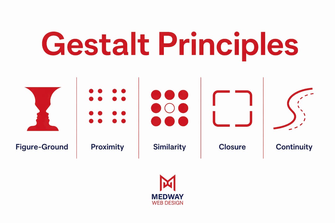
Figure-Ground
Every layout presents a foreground figure and a background ground. The brain separates these automatically, but only when contrast is sufficient. Poor contrast collapses this separation, leaving users uncertain about what is interactive and what is decorative. The Rubin’s vase illusion, in which the same image reads as either a vase or two faces depending on which region the viewer treats as figure, illustrates how ambiguous figure-ground relationships create perceptual instability. In UI design, that instability translates directly into user confusion.
Closure
The brain completes shapes that are partially obscured or outlined with gaps. Designers use this to create clean layouts where whitespace replaces explicit borders, trusting the user’s perception to infer groupings. The World Wildlife Fund logo, a panda rendered in partial outlines, is a widely cited example. In web interfaces, partial card outlines or truncated content at the edge of a viewport signal to users that more content exists beyond the visible area, encouraging scrolling or swiping.
Continuity
The eye follows lines, curves, and aligned edges along the path of least resistance. Layouts that align elements along a consistent grid exploit this principle to guide users from one content block to the next. Scanning patterns such as the F-pattern and Z-pattern, well established in eye-tracking research, are expressions of continuity at work. Designing with these natural reading paths in mind reduces the cognitive effort required to parse a page.
Common Region
“We perceive items grouped within a closed region as related to each other. To see the common region law at work, just check out a web page. The grouping of modules, sidebars, tabs, and accordions should feel logical and intuitive.” — Figma Resource Library
The law of common region is fundamental for structuring card layouts and dashboards. A container, a background colour change, or a subtle shadow communicates grouping even when the enclosed elements are not particularly close to one another. This makes common region especially useful in data-heavy interfaces where proximity alone cannot carry the full organisational load.
Symmetry and Prägnanz
The law of Prägnanz, from the German for “good figure,” states that the brain resolves ambiguous visual information into the simplest stable interpretation available. Interfaces that maintain clear geometric and spatial rhythm improve user navigation, particularly in dashboards where multiple data sets compete for attention. Interfaces maintaining clear spatial rhythm reduce the mental effort required to parse complex layouts. Symmetry, a related principle, satisfies the brain’s preference for balance and order, which is why symmetrical logo designs and page structures consistently read as trustworthy and professional.
Uniform connectedness and common fate
Two further principles deserve attention in dynamic interfaces. Uniform connectedness groups elements that share a visible link, such as items on the same progress tracker line. Common fate groups elements that move together, making animation a Gestalt tool: uniform connectedness and common fate improve user journey clarity in multi-step UI patterns like progress trackers and animation sequences. When a set of icons slides in together during an onboarding flow, users perceive them as a single conceptual unit.
Applying these principles effectively in real UI projects
Knowing the principles is one thing. Deploying them in a live project, where navigation, forms, dashboards, and responsive breakpoints all compete for design decisions, requires a structured approach.
Start with figure-ground. Designer Aaron Whittaker advises establishing strong figure-ground contrast first, providing a stable base for all other principles to organise content effectively. Before applying proximity or similarity to secondary elements, confirm that primary content stands out clearly against its background. A grayscale check during the wireframing phase is the most reliable method: if the hierarchy reads clearly without colour, it will hold across accessibility contexts and colour-deficient vision.
Layer proximity and similarity for navigation and forms. In a navigation menu, proximity groups items within a section while similarity, through consistent typographic treatment, signals that all items are navigational. Adding a common region, a header container with a distinct background, reinforces the grouping at a third perceptual level. For intuitive website navigation, this layering of principles is what separates a menu that users scan in under a second from one that requires deliberate reading. In forms, proximity between label and input removes the need for connecting lines, while similarity across all input fields signals that they belong to the same data-entry task.

Use common region in card-based layouts. Card UI patterns depend almost entirely on common region to communicate that an image, a title, a description, and a call-to-action button constitute a single content unit. The role of card UI design patterns in modern web design is inseparable from this principle. A subtle box shadow or a background colour shift achieves the grouping without heavy borders that would fragment the visual field.
Apply continuity to guide scanning paths. Aligning text blocks, images, and headings along a consistent vertical or horizontal axis creates the smooth path the eye follows naturally. This is particularly effective on long-form content pages and product listing pages, where users scan rather than read. Consistent grid alignment also makes responsive adaptation more predictable, because the visual logic that works at desktop width translates to narrower viewports without requiring a redesign of the perceptual relationships.
Test Gestalt-based layouts with real users. Tools such as Figma’s prototyping environment allow designers to run first-click tests and five-second tests against wireframes before any development begins. A five-second test, in which participants describe what they noticed after a brief exposure to a design, reveals whether the figure-ground hierarchy and focal points are communicating the intended priority. Eye-tracking studies confirm that users follow visual cues shaped by similarity, proximity, and focal points intuitively, making these tests a reliable proxy for real-world scanning behaviour.
Adapt principles for responsive design and accessibility. On mobile viewports, proximity relationships shift as columns collapse into single-column layouts. Designers must verify that groupings that relied on horizontal proximity at desktop width remain legible when stacked vertically. Colour-based similarity groupings require a non-colour alternative, such as shape or typographic weight, to remain accessible to users with colour-deficient vision. Meeting WCAG 2.2 guidelines for contrast ratios is the minimum standard for figure-ground compliance, and it should be verified at every responsive breakpoint, not just at the primary desktop resolution. For a detailed treatment of responsive adaptation, MedwayWebDesign’s responsive design guide covers breakpoint-specific considerations in depth.
Pro Tip: Begin every new layout by establishing figure-ground contrast in greyscale before introducing colour. Once the hierarchy reads clearly without colour, apply proximity and similarity to secondary elements. This sequence prevents colour from masking structural weaknesses that will become apparent when the design is viewed by users with colour-deficient vision or on low-contrast displays.
Common mistakes designers make when applying Gestalt principles
Gestalt principles are not self-correcting. Applied carelessly, they produce interfaces that are as confusing as those designed without any perceptual framework at all. The following errors appear consistently in UI audits.
Overusing closure to the point of false closure. Excessive use of incomplete shapes in navigation and content layout creates false closure, where users perceive a section as complete when additional content exists below the fold. This is a particular risk in mobile designs where partial cards are intended to signal scrollability but instead read as the end of the content. The fix is deliberate: use partial outlines or truncated content only when the design context makes the invitation to scroll or swipe unambiguous.
Allowing proximity to override intended similarity groupings. When two visually similar elements from different functional groups are placed close together, proximity wins the perceptual contest. Users group them by position rather than by visual style, breaking the intended information architecture. This conflict is common in dashboards where data modules from different categories sit adjacent to one another. Increasing the spatial separation between functional groups, or introducing a common region boundary, resolves the conflict without requiring a visual redesign.
Neglecting figure-ground contrast in complex interfaces. Poor contrast nullifies all Gestalt advantages. A layout that uses proximity and similarity correctly but places interactive elements on a background of insufficient contrast will still fail usability tests. This mistake is especially common when designers work on calibrated monitors that make subtle contrast differences appear more pronounced than they are on consumer displays. The greyscale wireframe check described earlier catches this before colour is introduced.
Applying principles inconsistently across responsive breakpoints. A grouping that works at 1440px can dissolve at 375px if the responsive rules were not designed with Gestalt relationships in mind. Proximity groupings that depend on horizontal spacing collapse when columns stack. Similarity groupings that rely on side-by-side comparison lose their meaning when elements are separated by scroll distance. Designers must audit each major breakpoint as a distinct perceptual environment, not simply as a scaled version of the desktop layout. The common UI design mistakes that appear most frequently in responsive projects trace back to this oversight.
Treating each principle as an isolated rule. Gestalt principles overlap dynamically; a single UI element can be influenced simultaneously by proximity, similarity, and figure-ground, requiring balanced design decisions. Designers who apply one principle at a time, without considering how it interacts with the others already active in the layout, produce interfaces where the principles clash rather than reinforce one another. The result is visual noise that users experience as confusion without being able to articulate why.
Pro Tip: Before adjusting any element in an existing layout, identify which Gestalt forces are currently active on that element. Ask whether proximity, similarity, figure-ground, or common region is governing its perceived relationship to neighbouring elements. Changing spacing, colour, or position without this audit often resolves one perceptual problem while creating another.
Research-backed insights and expert recommendations
The case for Gestalt principles in UI design extends well beyond perceptual theory. Empirical research and practitioner experience from organisations working at scale provide concrete evidence of their impact on user behaviour and business outcomes.
A 2020 study analysing 60 websites, drawn from the top 30 websites on the web and 30 Webby Award nominees from 2018 and 2019, found that successful web designs make heavy use of object similarity and symmetry. The same study found that top-performing sites deliberately limit the use of closure in interactive navigation, consistent with the false-closure risk described above. This is not a marginal finding. It reflects a deliberate design choice made by practitioners who understand that closure, while powerful in static graphic design, creates usability friction when applied to functional UI components.
Practitioners at Airbnb and Colgate report improved conversion and retention when similarity and proximity guide element grouping. These are not small-scale experiments. They represent Gestalt principles operating at the level of products used by millions of people, where even marginal improvements in task completion rates translate into measurable commercial outcomes.
“The most surprising insight I’ve gained is that Gestalt principles work best when combined strategically. Rather than applying each rule in isolation, consider how they can work together to create a cohesive user experience.” — Aaron Whittaker, designer
Eye-tracking studies confirm that users follow visual cues shaped by similarity, proximity, and focal points intuitively, producing quicker decision-making and lower error rates. The strong visual hierarchy created by correctly applied Gestalt principles allows users to scan and engage more efficiently. This finding aligns with the broader principle that Gestalt principles reduce task completion time on complex, data-heavy interfaces by enhancing visual structure and grouping.
One particularly instructive practitioner case involves a team that audited their interface and discovered their similarity groupings relied too heavily on colour alone. Shifting to a combination of shape and colour patterns made the interface accessible to users with colour-deficient vision and significantly improved user satisfaction among that group. The lesson is that Gestalt principles and accessibility compliance are not separate concerns. When figure-ground contrast meets WCAG 2.2 standards and similarity groupings use multiple visual attributes rather than colour alone, the design serves a broader audience without compromising its perceptual logic.
Senior practitioners treat Gestalt not as a checklist but as a diagnostic framework. When an interface feels cluttered or confusing, the productive question is not “which rule am I missing?” but “which visual forces are currently active, and are they reinforcing or contradicting each other?” This perspective, viewing the principles as interacting forces rather than isolated rules, is what separates designers who apply Gestalt competently from those who use it to produce genuinely intuitive interfaces. For teams looking to translate these principles into measurable business outcomes, MedwayWebDesign’s web design and growth guide examines the direct relationship between perceptual design quality and conversion performance.
For product teams evaluating whether their current interface architecture is structurally sound before committing to a development cycle, Spark Concept’s idea checker offers a structured way to assess digital product concepts against usability and grouping principles before design work begins.
Key takeaways
Gestalt principles are not aesthetic guidelines but perceptual laws that, when applied in the correct sequence and combination, produce interfaces users navigate faster, with fewer errors, and with greater confidence.
| Point | Details |
|---|---|
| Start with figure-ground | Establish clear foreground-background contrast in greyscale before applying any other principle. |
| Layer principles deliberately | Proximity, similarity, and common region work together; apply them as interacting forces, not isolated rules. |
| Limit closure in navigation | Top-performing sites use low closure in functional UI to avoid false closure and hidden-content confusion. |
| Audit every responsive breakpoint | Gestalt groupings that hold at desktop width can dissolve at mobile viewports; verify each breakpoint separately. |
| Validate with user testing | Five-second tests and eye-tracking studies confirm whether figure-ground hierarchy and focal points communicate the intended priority. |
How MedwayWebDesign applies Gestalt principles in practice

MedwayWebDesign builds every client project on the perceptual foundations described throughout this article. Figure-ground contrast is established at the wireframe stage, before colour or typography decisions are made. Proximity and similarity are applied systematically across navigation, forms, and card layouts, and each design is audited at multiple responsive breakpoints to confirm that groupings remain legible across device types.
For businesses that need a web presence built on these principles from the ground up, MedwayWebDesign’s practical guide to business web design sets out the full process, from initial research through to a delivered interface that users understand without instruction.