
Intuitive website navigation is defined as a menu system that aligns with users’ mental models, enabling them to find content quickly without confusion or backtracking. The industry term for this discipline is navigation UX design, and it sits within the broader field of information architecture (IA). Poor navigation is one of the most common reasons visitors leave a site without converting. Navigation as a sub-discipline of IA means that before you design intuitive website navigation menu structures, you must first organise your content logically. MedwayWebDesign applies this principle across every project, treating navigation as a structural decision, not a visual one.
How to plan and structure your site’s information architecture
Strong information architecture is the prerequisite for any clear, user-friendly navigation design. IA mirrors user mental models, not your company’s internal folder structure or departmental logic. If your categories make sense to your team but confuse your visitors, the navigation will fail regardless of how well it is styled.
The first step is content grouping. Dividing content into clear categories and building your main navigation from the most important groups creates a structure users can predict. A useful exercise is card sorting, where real users group pages into categories they find natural. The results frequently contradict internal assumptions.
Balancing depth and breadth is the second structural decision. A flat structure with too many top-level items overwhelms users. A deep structure with many nested levels forces excessive clicking. The practical target is two to three levels of hierarchy for most business sites, with the most critical pages reachable within two clicks from the homepage.
- Group related content under a single parent category before touching any design tool.
- Avoid creating navigation categories that exist only because a department requested them.
- Test your proposed structure with five to ten real users before committing to a visual design.
- Resolve categorisation conflicts at the IA stage, not after the site is built.
Pro Tip: Run a tree test using your proposed IA before designing a single menu item. Tree testing reveals whether users can find pages using only text labels, stripping away visual design entirely.
For a deeper grounding in this topic, MedwayWebDesign’s guide on website information architecture explains how IA decisions directly shape navigation clarity and user satisfaction.
What are the best practices for designing clear navigation menus?
Limiting primary navigation to five to seven items is the single most impactful decision you can make. Research and industry standards recommend 5–7 primary links to reduce cognitive load and increase user satisfaction. This is grounded in Hick’s Law, which states that decision time increases with the number of choices. Fewer options produce faster, more confident decisions.

Label clarity is equally critical. Plain, descriptive labels outperform clever or branded names every time. “Our Story” is weaker than “About Us.” “Solutions” tells a visitor nothing; “Services” is immediately understood. The label must communicate the destination, not the brand’s personality.
The following principles form the foundation of effective menu layout design:
- Place the most important links first and last. Users recall items at the start and end of a list more reliably than those in the middle, a phenomenon known as the serial position effect.
- Maintain consistent placement across every page. Navigation that shifts position between pages forces users to reorient themselves constantly.
- Indicate the current page or section clearly. A highlighted or underlined active state removes ambiguity about where the user is within the site.
- Use sticky navigation on long pages. Sticky navigation keeps primary links reachable without scrolling, but the bar must remain slim so it does not consume screen space.
- Test labels with real users before launch. Ask five users to describe what they expect to find behind each label. Mismatches reveal labelling problems immediately.
Pro Tip: Replace any navigation label that requires a tooltip or explanatory subtext. If the label needs explaining, it is the wrong label.
How to design navigation menus for mobile devices
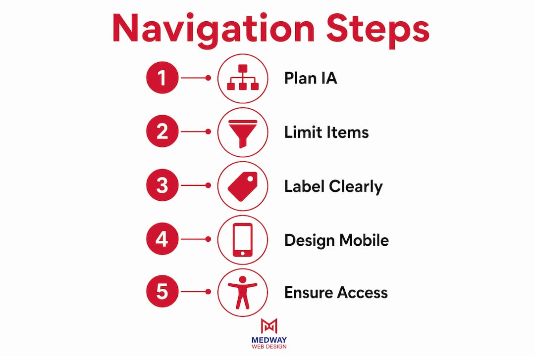
Mobile navigation requires entirely separate structural decisions, not a scaled-down copy of the desktop menu. Mobile navigation must be distinct from desktop nav, adapted to touch interaction and smaller screen dimensions. The constraints are physical: a thumb cannot hover, and a 375px screen cannot display eight horizontal links.
Apple and Google’s design standards recommend 3–5 primary destinations for thumb-friendly bottom navigation bars. This pattern places the most-used sections within easy thumb reach, reducing the effort required to move between core areas of the site. For sites with more than five primary sections, a hybrid approach works well: show the top four destinations in the bottom bar and place remaining items in an overflow menu accessed via a “More” tab.
The table below compares the two primary mobile navigation patterns:
| Pattern | Best for | Key constraint |
|---|---|---|
| Bottom navigation bar | 3–5 primary destinations | Requires strict prioritisation of top tasks |
| Hamburger overflow menu | 6+ destinations | Reduces discoverability; use only for secondary items |
| Tab bar with “More” tab | 5–8 destinations | Balances access with screen economy |
Additional mobile-specific requirements include tap targets of at least 44 x 44 pixels per Apple’s Human Interface Guidelines, and testing on physical devices rather than browser emulators. Emulators do not replicate thumb reach or real-world scrolling behaviour accurately.
For a broader view of how navigation fits within responsive design principles, MedwayWebDesign’s 2026 guide covers the full structural approach to cross-device design.
How to incorporate accessibility and wayfinding into navigation
Accessible navigation improves usability for every visitor, not only those with disabilities. W3C guidance mandates clear visual signals for nested menus per WCAG 2.1, including triangles or “+” signs to indicate sub-menus. These signals reduce cognitive load by making the menu’s structure visible before a user commits to clicking.
Breadcrumbs serve as a secondary wayfinding tool, not a replacement for primary navigation. Breadcrumbs should map the user’s actual path, not the CMS folder structure. A breadcrumb trail that reads “Home > Content > 2026 > June > Article” reflects a file system, not a user journey. A trail that reads “Home > Blog > Navigation Design” reflects how a user arrived and where they are.
Visual hierarchy within the menu itself communicates depth and location. Bold or larger text for top-level items, with smaller or lighter text for sub-items, gives users an immediate sense of where they sit within the site. Colour contrast between active and inactive states must meet WCAG 2.1’s minimum contrast ratio of 4.5:1 for normal text.
“Good navigation design mirrors user mental models, not the company’s internal system structures.” — Navigation UX Design Best Practices, 2026
Accessibility testing should include keyboard-only navigation checks, screen reader testing with tools such as NVDA or VoiceOver, and a review against the WCAG 2.1 AA standard. These checks catch structural problems that visual inspection misses entirely.
Common mistakes that damage website navigation usability
Overloading the primary menu is the most frequent error. Excess navigation options degrade performance per Hick’s Law, and the effect is measurable: users slow down, hesitate, and abandon tasks more often when faced with too many choices. The fix is ruthless prioritisation at the IA stage, before any visual design begins.
Vague labels are the second most damaging mistake. Labels like “Resources,” “Insights,” or “Solutions” communicate nothing specific. Users cannot predict what they will find, so they either guess or leave. Replace every vague label with a concrete noun that names the content directly.
- Hiding key links behind a desktop hamburger menu. Hidden navigation gets significantly fewer clicks on desktop, reducing discoverability substantially. Reserve hamburger menus for mobile contexts.
- Inconsistent navigation placement. Moving the menu between pages, or changing its visual style, forces users to relearn the interface on every page.
- Ignoring mobile-specific needs. Replicating a desktop navigation structure on mobile without adaptation produces tap targets that are too small and menus that are too wide for the screen.
- Skipping iterative testing. Navigation problems rarely surface in stakeholder reviews. They surface when real users attempt real tasks.
Pro Tip: Run a five-second test on your homepage. Show it to a new user for five seconds, then ask them to name the main sections of the site. If they cannot, your navigation labels or placement needs revision.
For a broader list of interface errors that affect usability, MedwayWebDesign’s guide on common UI design mistakes covers the full range of structural and visual pitfalls to address in 2026.
Key takeaways
Effective navigation design requires clear IA, limited menu items, accessible visual signals, and mobile-specific structural decisions made before any visual design begins.
| Point | Details |
|---|---|
| IA before UI | Resolve content categorisation and user mental models before designing any menu visuals. |
| Limit primary items | Keep top-level navigation to 5–7 links to reduce cognitive load and speed up decisions. |
| Mobile needs separate design | Use bottom navigation bars with 3–5 destinations; never replicate desktop menus on mobile. |
| Accessibility is structural | Apply WCAG 2.1 visual signals, contrast ratios, and breadcrumb best practices from the start. |
| Test with real users | Five-second tests and tree tests reveal labelling and structure problems that internal reviews miss. |
Navigation design: what I have learned from real projects
The most persistent mistake I see is teams treating navigation as a finishing touch. They spend weeks on visual design, then add the menu in the final days before launch. By that point, the IA is locked, the labels are whatever the client suggested, and there is no time to test. The result is a site that looks polished but performs poorly.
The tension between findability and discoverability is real and worth taking seriously. Prioritising one improves clarity, but most sites need a deliberate choice about which matters more for their audience. An e-commerce site prioritises findability: users know what they want and need to reach it fast. A content-led site often prioritises discoverability: users are browsing and need to be drawn into related content. Designing the same navigation pattern for both contexts produces mediocre results for each.
Cross-device consistency is non-negotiable, but it does not mean identical menus. It means that a user who switches from desktop to mobile should feel they are on the same site, even if the navigation structure differs. Achieving that requires deliberate design decisions at the IA stage, not retrofitting a mobile menu after the desktop version is complete.
My strongest recommendation is to invest in a single round of user testing before the site goes live. Five users completing three tasks will surface more navigation problems than any internal review. The cost is low. The return is a site that works from day one rather than requiring fixes after launch.
— Ian Rickard
How MedwayWebDesign builds navigation that works for small businesses
Navigation design is where many small business websites lose visitors before they ever reach a product or service page. MedwayWebDesign’s approach to custom web design for small businesses begins with IA planning and user research, not templates. Every menu structure is built around how your customers think, not how your business is organised internally.
The agency’s process includes label testing, mobile-specific navigation planning, and WCAG 2.1 accessibility checks as standard deliverables. Small business owners benefit from a navigation structure that reduces bounce rates, improves time on site, and guides visitors toward conversion points. If your current site navigation is losing visitors, MedwayWebDesign offers a consultation to identify the structural issues and propose a clear path to resolution.
FAQ
What is the ideal number of items in a primary navigation menu?
Industry standards recommend 5–7 primary links to reduce cognitive load. More items increase decision time and reduce the likelihood that users will find what they need.
Why should mobile navigation differ from desktop navigation?
Mobile navigation requires separate structural decisions because touch interaction, screen size, and thumb reach all differ from desktop. Replicating a desktop menu on mobile produces tap targets that are too small and layouts that do not fit the screen.
What are breadcrumbs and when should I use them?
Breadcrumbs are a secondary wayfinding tool that shows users their current location within a site. They work best on deep sites with multiple content levels, and should map the user’s path, not the CMS folder structure.
How do I make navigation accessible for users with disabilities?
Apply WCAG 2.1 standards: use clear visual indicators for sub-menus, maintain a minimum contrast ratio of 4.5:1, and test with keyboard-only navigation and screen readers such as NVDA or VoiceOver.
What is the biggest mistake in website navigation design?
Overloading the primary menu with too many items is the most damaging error. Excess navigation options degrade task performance per Hick’s Law, and the fix requires prioritisation at the IA stage before visual design begins.