
UX (user experience) is defined as the full journey a person takes through a product, covering usability, flow, and emotional satisfaction. UI (user interface) is the visual and interactive layer that users see and touch. Understanding how UX differs from UI is the foundation of effective digital product design. 40% of U.S. consumers prefer digital interaction over in-person engagement, which means the quality of both disciplines directly affects business outcomes. Tools like Figma, concepts such as wireframes and design systems, and frameworks like user journey mapping all sit at the intersection of these two complementary but distinct roles.
How UX differs from UI: definitions and core distinctions
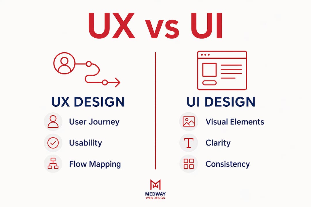
UX governs the entire journey; UI governs the visual layer. This single distinction shapes every decision a design team makes. UX asks: does this product make sense to the person using it? UI asks: does this product look and feel right? Both questions matter, but they require different thinking, different deliverables, and different skill sets.
Don Norman coined the term “User Experience” specifically to enlarge design scope beyond screen aesthetics. His intent was to capture every aspect of a person’s interaction with a company, its services, and its products. That breadth is what separates UX from UI at a conceptual level. UI is a subset of UX, not its equal.

A useful way to frame the distinction: UX is the blueprint of a building, and UI is the interior design. The blueprint determines whether rooms connect logically, whether corridors are wide enough, and whether the building serves its purpose. The interior design determines the colours, textures, and furniture that make it pleasant to inhabit. Neither works without the other, but they are not the same discipline.
What is UX design and what processes define it?
UX design is the practice of structuring a product’s logic, flow, and usability so that people can achieve their goals with minimal friction. It is rooted in research and problem-solving, not visual craft. The five-step UX process covers research, problem definition, prototyping, testing, and iteration. Each step informs the next, and the cycle repeats as new data emerges.
The typical deliverables from a UX process include:
- User personas that represent distinct audience segments and their goals
- User journey maps that chart every touchpoint from first awareness to task completion
- Wireframes that define layout and information hierarchy without visual styling
- Usability test reports that document where people struggle and why
- Information architecture diagrams that show how content and features are organised
These outputs are structural, not decorative. A wireframe does not specify button colours. A journey map does not specify typography. UX designers work at the level of logic and behaviour, leaving visual decisions to the UI stage.
UX also extends beyond screens. UX covers all touchpoints including non-visual elements such as onboarding emails, error messages, and loading states. A poorly worded error message is a UX failure, even if the interface looks polished. This is why UX practitioners must understand website information architecture as a core competency, not an optional extra.
Pro Tip: Beginners frequently focus on mastering Figma before they understand user research. Understanding ‘why’ before ‘how’ is the single most important shift a new designer can make. Tools are only as effective as the thinking behind them.
What is UI design and what principles guide it?
UI design is the practice of creating the visual elements and interactive components that users engage with directly. Where UX defines the structure, UI defines the surface. A UI designer works with colour palettes, typography, iconography, spacing, button states, and micro-interactions to produce a product that is both usable and visually coherent.
The core deliverables of UI design include:
- High-fidelity mockups that show the final visual appearance of every screen
- Design systems and component libraries that enforce visual consistency across a product
- Style guides that document colour values, font choices, and spacing rules
- Interactive prototypes that demonstrate transitions and state changes
- Accessibility specifications that define contrast ratios and touch target sizes
UI design principles centre on clarity, consistency, and feedback. A button must look like a button. A selected state must be visually distinct from an unselected one. Colour must reinforce meaning, not contradict it. These are not aesthetic preferences; they are usability requirements. Card UI design patterns are a practical example of how visual structure and interaction design combine to guide attention and action.
The most common UI failures stem from inconsistency. A team that uses three different button styles across a single product creates cognitive load for the user. Design systems, popularised by organisations such as Google with Material Design and IBM with Carbon, exist precisely to prevent this. Reviewing common UI design mistakes is a productive exercise for any designer looking to tighten their visual output.
Pro Tip: Build your component library before you build your screens. Designing buttons, inputs, and cards in isolation first forces consistency and saves significant time during the mockup phase.
UX vs UI: a direct comparison
| Dimension | UX design | UI design |
|---|---|---|
| Primary focus | User journey and usability | Visual elements and interaction |
| Core deliverables | Personas, wireframes, journey maps | Mockups, style guides, design systems |
| Key question | Does this work for the user? | Does this look and feel right? |
| Tools commonly used | Miro, Maze, UserTesting | Figma, Sketch, Adobe XD |
| Measured by | Task completion, error rates | Visual consistency, accessibility scores |
How do UX and UI collaborate in practice?
Successful products require integrated UX and UI efforts from the earliest stages of a project. The handoff between the two disciplines is not a single event; it is a continuous loop. A UX designer produces a wireframe, the UI designer applies visual treatment, usability testing reveals a problem, and the wireframe is revised. This cycle repeats throughout the product lifecycle.
The UX to UI handoff is iterative, not linear. Designers who treat it as a one-way process produce weaker products. UI decisions frequently expose UX problems. When a UI designer tries to apply visual hierarchy to a wireframe and finds the layout resists it, that is a signal that the UX structure needs revision. The feedback flows in both directions.
“UI without UX leads to products that look good but fail to function. UX without UI leads to products that work logically but feel unfinished and unclear.”
In smaller teams, the boundary between UX and UI blurs considerably. A single designer may own both the journey mapping and the visual execution. UX and UI roles often blur in smaller teams, with the design lifecycle involving continuous iteration between usability tests and interface updates. This is not a problem; it is a reality that requires designers to develop fluency in both disciplines. Successful designers develop fluency in both logical UX structure and visual UI systems.
The collaboration also depends on shared language. When a UX designer hands over a wireframe annotated with interaction notes, the UI designer needs to understand the intent behind each decision. Teams that invest in shared documentation, design critiques, and joint user testing sessions produce more coherent products than those that work in silos.
Practical examples of how UX and UI play different roles
The architect and interior designer analogy holds up well in practice. Consider an e-commerce checkout flow. The UX designer determines how many steps the checkout requires, where error messages appear, and how the system handles a failed payment. The UI designer determines the colour of the “Place Order” button, the typography of the confirmation screen, and the animation that signals a successful transaction.
- Onboarding flow: UX maps the sequence of steps a new user takes to complete setup. UI designs the progress indicator, the illustrations, and the tone of the copy on each screen.
- Search results page: UX defines the filters, sorting logic, and result density. UI designs the card layout, the filter panel appearance, and the hover states.
- Error handling: UX writes the logic for when and how errors appear. UI designs the error state visually, including colour, iconography, and placement.
- Mobile navigation: UX determines the information architecture and the depth of the menu structure. UI designs the hamburger icon, the drawer animation, and the active state indicators.
The business case for getting both right is clear. Strong UX correlates with 200–400% conversion increases and measurable revenue growth. That figure reflects the compounding effect of removing friction at every stage of the user journey. The role of web design in business growth is well documented, and UX quality is a primary driver of that relationship. Equally, interaction design fundamentals underpin both disciplines and are worth studying in depth.
An often-overlooked example is the mobile experience. UX decisions about tap target size, scroll depth, and content prioritisation on small screens directly affect whether a user completes a task or abandons it. The mobile ecommerce experience illustrates how UX and UI must work in concert to retain users on constrained screen sizes.
Key takeaways
UX and UI are distinct disciplines that require different processes, deliverables, and skills, but produce their best results through continuous collaboration.
| Point | Details |
|---|---|
| UX defines structure and flow | UX governs the logic, journey, and usability of a product before any visual design begins. |
| UI defines the visual surface | UI creates the components, colours, and interactions that users see and engage with directly. |
| Collaboration is iterative | The handoff between UX and UI is a continuous loop, not a one-time event. |
| Both disciplines affect business outcomes | Strong UX can drive conversion increases of 200–400%, making it a measurable business asset. |
| Fluency in both disciplines is an advantage | Designers who understand UX logic and UI craft produce more coherent and effective products. |
Why the UX-first mindset changes everything
I have worked with design teams that treated UX as a preliminary formality and UI as the “real” work. The products they shipped looked impressive in screenshots and fell apart the moment a real user tried to complete a task. The visual polish masked structural failures until user testing exposed them, at which point the cost of revision was significant.
The most persistent misconception I encounter is that UX is just wireframing. Wireframes are a UX deliverable, not the discipline itself. UX is the practice of understanding what a person is trying to accomplish and removing every obstacle between them and that goal. Don Norman’s original framing of user experience design was deliberately broad for this reason. The scope includes brand perception, emotional response, and performance, not just screen layout.
My practical advice for designers who want to improve: spend more time in user research before you open Figma. Conduct five usability tests on your current product and watch where people hesitate. Those hesitations are UX problems, and no amount of visual refinement will resolve them. Once the structure is sound, UI work becomes faster and more purposeful because every visual decision has a clear rationale behind it.
The future of design roles points toward integration rather than separation. Organisations that hire separate UX and UI specialists still need those specialists to collaborate from day one. The designers who will be most valuable are those who can move fluidly between journey mapping and component design, between user research and visual systems. That fluency is not a luxury; it is the standard the industry is moving towards.
— Ian Rickard
Design resources from MedwayWebDesign
MedwayWebDesign publishes practical guides that cover the full spectrum of digital product design, from foundational principles to applied techniques. Whether you are working through your first UX process or refining a mature design system, the resources below offer structured, expert guidance grounded in real project experience.
The responsive design guide covers how adaptive layouts intersect with UX decisions across device types, a critical consideration for any designer working on multi-platform products. For those looking to apply UX and UI principles within a commercial context, the MedwayWebDesign homepage provides an overview of the agency’s approach to user-centred web design, including case studies and service detail. Every guide is written for practitioners who need clarity, not theory.
FAQ
What is the simplest way to distinguish UX from UI?
UX is the structure and logic of a product’s journey; UI is the visual and interactive layer users see and touch. UX asks whether the product works; UI asks whether it looks and feels right.
Can one designer handle both UX and UI?
Yes, particularly in smaller teams where roles often blur. The best results come from designers who develop fluency in both UX logic and UI visual systems, even when working as a single practitioner.
Why does UX matter more than UI for conversion rates?
UX removes friction from the user journey, which directly affects whether a person completes a task. Strong UX improvements correlate with conversion increases of 200–400%, whereas visual changes alone produce smaller and less consistent gains.
What tools do UX and UI designers use?
UX designers commonly use Miro for journey mapping, Maze and UserTesting for usability research, and Figma for wireframing. UI designers use Figma, Sketch, and Adobe XD for high-fidelity mockups and component libraries.
Does UX include non-visual elements like emails and error messages?
Yes. UX covers all touchpoints that affect user perception, including onboarding emails, error handling, and loading states. These non-visual elements are UX responsibilities because they shape the overall experience of a product.