
E-commerce website design is the process of creating a user-friendly, visually cohesive online store that maximises conversions and builds customer trust. For small business owners, getting this right is not optional. Mobile devices account for nearly 50% of global e-commerce sales, which means your store must perform flawlessly on a smartphone before anything else. Poor design does not just look unprofessional. It costs you sales, erodes trust, and sends customers to a competitor before they have read a single product description. This guide covers the principles, technical requirements, and practical decisions that determine whether your online store converts browsers into buyers.
What are the core principles of e-commerce website design?
The UX principles that outlast design trends are the ones that reliably convert visitors in 2026. Small business owners often chase visual novelty when the real gains come from applying established interaction design standards consistently.
Mobile-first design is the non-negotiable baseline. Because mobile drives most buying journeys, designing for desktop first and then scaling down produces a compromised mobile experience. The correct approach is to design the mobile layout first, then expand it for larger screens. This forces clarity and prioritisation from the outset.

Clear navigation and intuitive information architecture are equally critical. Shoppers who cannot find a product within two or three clicks will leave. A well-structured website navigation menu uses logical category hierarchies, persistent search, and breadcrumb trails to keep users oriented at every step.
Visibility of system status is a principle borrowed from Jakob Nielsen’s ten usability heuristics, and it directly affects conversion rates. When a customer clicks “Add to Cart,” the interface must respond immediately with a visual confirmation. Silence in the UI creates doubt, and doubt kills purchases.
- Mobile-first layout: Design for the smallest screen first, then scale up.
- Persistent search bar: Visible on every page, not hidden behind an icon.
- Real-time UI feedback: Confirm every user action, from adding items to applying discount codes.
- Consistent visual language: Use the same fonts, button styles, and colour palette throughout.
- Error prevention: Validate form fields inline before submission, not after.
Pro Tip: Test your store’s navigation on a real smartphone with one hand. If you cannot reach the primary menu or search bar with your thumb, your layout needs restructuring.
How to optimise product pages and your homepage for conversions
Homepage and product pages carry the most conversion weight in any online store, and they must be designed as an integrated system rather than isolated layouts. A homepage that fails to orient the visitor immediately wastes every pound spent on advertising.
Homepage: orient, not impress
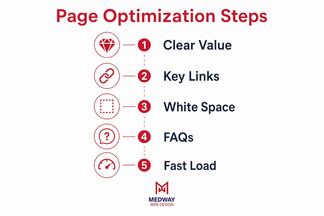
A clear value proposition above the fold, combined with links to key product categories, is the most effective homepage structure. Visitors should understand within three seconds what you sell, who it is for, and why they should buy from you. Avoid full-screen video backgrounds and heavy carousels. They slow load times and distract from the primary call to action.
White space is a conversion tool, not wasted space. Generous spacing around product categories and calls to action reduces cognitive load and directs the eye. MedwayWebDesign’s work consistently shows that stores with cleaner homepages outperform cluttered ones, regardless of the product category. You can read more about using white space effectively to understand why this principle matters technically.
Product pages: treat each one as a mini landing page
Products with multiple high-quality images and 360-degree views see higher conversion rates than those with basic photos. This is not a minor detail. For a small business selling physical goods, photography quality is often the single highest-return investment you can make. Pair strong visuals with detailed product descriptions that answer the questions a customer would ask in a physical shop.
Trust signals belong on every product page. Customer reviews, star ratings, clear returns policies, and security badges all reduce the perceived risk of purchase. Social proof is particularly powerful for small businesses that lack the brand recognition of larger retailers. A single page with 40 genuine reviews will consistently outperform a polished page with none.
- Above-the-fold value proposition: State what you sell and why it matters before the scroll.
- High-resolution images: Include multiple angles and, where possible, lifestyle photography.
- Detailed product information: Dimensions, materials, compatibility, and care instructions reduce returns.
- Customer reviews: Display them prominently, not buried at the bottom of the page.
- Clear calls to action: One primary button per page, with a contrasting colour that stands out.
Pro Tip: Add a “Frequently Asked Questions” section to your product pages. It reduces pre-purchase support queries and addresses objections at the exact moment a customer is deciding whether to buy.
For a deeper look at product page optimisation, MedwayWebDesign has published a dedicated 2026 guide covering layout, copy, and technical considerations.
Which technical factors affect e-commerce design success?
Page speed is the technical factor with the most direct impact on revenue. Every extra second of delay on mobile can reduce conversion rates by 7% or more. That figure compounds quickly across thousands of monthly visitors. Speed is not a developer concern separate from design. It is a design decision made every time you add an image, a font, or a third-party script.
Core Web Vitals, Google’s set of page experience metrics, measure Largest Contentful Paint (LCP), Interaction to Next Paint (INP), and Cumulative Layout Shift (CLS). Each metric reflects a real user experience. LCP measures how quickly the main content loads. INP measures how fast the page responds to clicks. CLS measures whether elements jump around as the page loads. Failing any of these metrics harms both user experience and search rankings.
The following technical decisions have the greatest impact on performance for small business online stores:
- Image optimisation: Compress all images using modern formats such as WebP. Uncompressed images are the most common cause of slow load times.
- Lazy loading: Load images and videos only when they enter the viewport. This reduces initial page weight significantly.
- Content Delivery Network (CDN): Serve assets from servers geographically close to your customers. A CDN reduces latency without requiring any changes to your store’s code.
- Minimal third-party scripts: Every analytics tag, chat widget, and social media pixel adds load time. Audit your scripts quarterly and remove anything that does not contribute measurable value.
- Responsive e-commerce themes: Choose a theme built for performance, not just aesthetics. A responsive design foundation ensures your store adapts correctly to every screen size without duplicating code.
| Technical factor | Impact on conversions |
|---|---|
| Page speed (LCP under 2.5 seconds) | Direct reduction in bounce rate and cart abandonment |
| Mobile responsiveness | Reaches the nearly 50% of shoppers buying on mobile |
| Image optimisation (WebP format) | Faster load times without visible quality loss |
| CDN implementation | Reduced latency for geographically distributed customers |
| Core Web Vitals compliance | Improved search rankings and user experience scores |
Performance also affects your advertising efficiency. A slow landing page wastes paid traffic. Every click you buy from Google Ads or Meta that lands on a page taking four seconds to load is money spent acquiring a visitor who leaves before converting.
What are effective strategies to reduce cart abandonment?
Cart abandonment is the most measurable symptom of poor checkout design. Simplifying checkout and providing guest checkout options with mobile wallet integration significantly reduces abandonment rates. The checkout flow should require the minimum number of steps and fields to complete a purchase.
Surprise fees are the most common reason customers abandon at the final stage. Shipping costs, taxes, and handling fees must appear early in the process, ideally on the product page or in the basket. Revealing a £6.99 delivery charge on the payment screen after a customer has entered their address is a design failure with a direct cost.
Mobile wallets such as Apple Pay and Google Pay reduce checkout friction and accelerate purchases by eliminating manual card entry. For mobile shoppers, this can be the difference between completing a purchase and abandoning it. Offering these options alongside standard card payment is now a baseline expectation, not a premium feature.
- Guest checkout: Never force account creation before purchase. Offer it as an option after the order is confirmed.
- Progress indicators: Show customers exactly where they are in the checkout process with a clear step counter.
- Inline field validation: Flag errors as the customer types, not after they click “Place Order.”
- Transparent pricing: Display all costs, including delivery and VAT, before the payment screen.
- Reassurance signals: Display security badges, accepted payment logos, and a clear returns policy at the checkout stage.
Pro Tip: Review your checkout flow on a mobile device using a slow 3G connection simulation in Chrome DevTools. The friction points that appear will be exactly what your customers experience on weaker networks.
What common design mistakes should small businesses avoid?
The most damaging mistakes in online store design are structural, not cosmetic. Inconsistent visual language and overloaded pages slow site speed and confuse visitors, directly harming conversions. Fixing these issues requires discipline, not a complete redesign.
Treating desktop as the primary design surface is the most widespread error among small business owners building their first store. Because mobile accounts for nearly half of global e-commerce sales, a desktop-first approach guarantees a substandard experience for your largest audience segment. The mobile shopping experience deserves the same design attention as any other part of the store.
- Desktop-first design: Produces cramped, poorly adapted mobile layouts that frustrate shoppers.
- Overloaded pages: Too many products, banners, and pop-ups on a single page harm both speed and clarity.
- Inconsistent navigation: Menus that change structure between pages disorient users and increase bounce rates.
- Content written for the brand, not the customer: Product descriptions that focus on features rather than benefits fail to answer the customer’s core question: “What does this do for me?”
- No UX testing: Launching a store and never reviewing session recordings or A/B test results means design problems compound silently over time.
Common UI design mistakes often overlap with these structural issues. Addressing them systematically, rather than reactively, produces the most durable improvements.
Key takeaways
Effective e-commerce website design requires mobile-first architecture, fast page performance, and a checkout flow built to remove friction at every stage.
| Point | Details |
|---|---|
| Mobile-first is non-negotiable | Nearly 50% of global e-commerce sales happen on mobile; design for that screen first. |
| Speed directly affects revenue | Every extra second of mobile delay can cut conversion rates by 7% or more. |
| Product pages are conversion pages | High-quality images, customer reviews, and clear calls to action are the three highest-impact elements. |
| Checkout friction kills sales | Guest checkout, transparent pricing, and mobile wallets reduce abandonment at the final stage. |
| UX testing drives sustained growth | Regular A/B testing and session replay analysis produce steady, compounding conversion gains. |
What I have learned from watching small businesses design their stores
The most common mistake I see is not a technical one. It is the assumption that a beautiful store will automatically be a converting store. Small business owners invest heavily in brand photography and colour palettes, then launch a site with a four-second load time and a checkout that requires account creation. The visual work is wasted because the structural work was not done first.
The businesses that perform best treat their online store as a product, not a project. They launch with a functional, fast, and clear design, then improve it continuously based on real user behaviour. Session recordings, heatmaps, and A/B tests are not enterprise tools. They are available to any small business and they answer questions that no amount of design intuition can.
The other pattern I notice consistently is the tension between brand uniqueness and familiar UX conventions. Every business wants to stand out. But shoppers arrive at your store with expectations formed by years of online shopping. Putting the basket icon somewhere unexpected, or hiding the search bar, does not feel distinctive to the customer. It feels broken. The most effective stores are distinctive in their visual identity and entirely conventional in their interaction patterns.
My practical advice on technology is simple: choose a platform and design partner based on their track record with stores of your size and sector, not on feature lists. The right custom web design approach for a small business is one that prioritises performance and usability from day one, with room to grow as your catalogue and traffic increase.
— Ian Rickard
How MedwayWebDesign builds e-commerce stores that convert
MedwayWebDesign works with small businesses that need an online store built to perform, not just to look good. Every project starts with market research and user-centred design, so the final store reflects how your customers actually shop rather than how you imagine they do.
The agency’s approach covers responsive design, Core Web Vitals compliance, product page architecture, and checkout optimisation as standard. If you are building your first store or rebuilding one that is not converting, the custom web design for small businesses page explains how MedwayWebDesign structures each engagement. For businesses that also want to improve search visibility alongside design, the e-commerce SEO guide covers how both disciplines work together to drive sustainable growth.
FAQ
What is e-commerce website design?
E-commerce website design is the process of planning and building an online store’s layout, navigation, visual style, and checkout flow to maximise sales and user satisfaction. It covers both aesthetic decisions and technical performance requirements.
How does mobile-first design affect my online store?
Mobile devices account for nearly 50% of global e-commerce sales, so a mobile-first design ensures your store performs well for the majority of your shoppers. Designing for mobile first also forces clearer layouts that benefit all screen sizes.
What is the most effective way to reduce cart abandonment?
Offering guest checkout, displaying all costs before the payment screen, and accepting mobile wallets such as Apple Pay and Google Pay are the three most effective tactics for reducing cart abandonment at the checkout stage.
How do Core Web Vitals affect my e-commerce store?
Core Web Vitals measure load speed (LCP), interactivity (INP), and visual stability (CLS). Poor scores harm both user experience and Google search rankings, which reduces organic traffic to your store.
How often should I update my store’s design?
Regular small UX updates based on session replays and A/B testing produce steady conversion gains over time. A complete redesign is rarely necessary. Continuous, data-driven iteration is more effective and less disruptive than periodic overhauls.